Curated color palettes
Colors in February: 3 Ready-to-Use Palettes
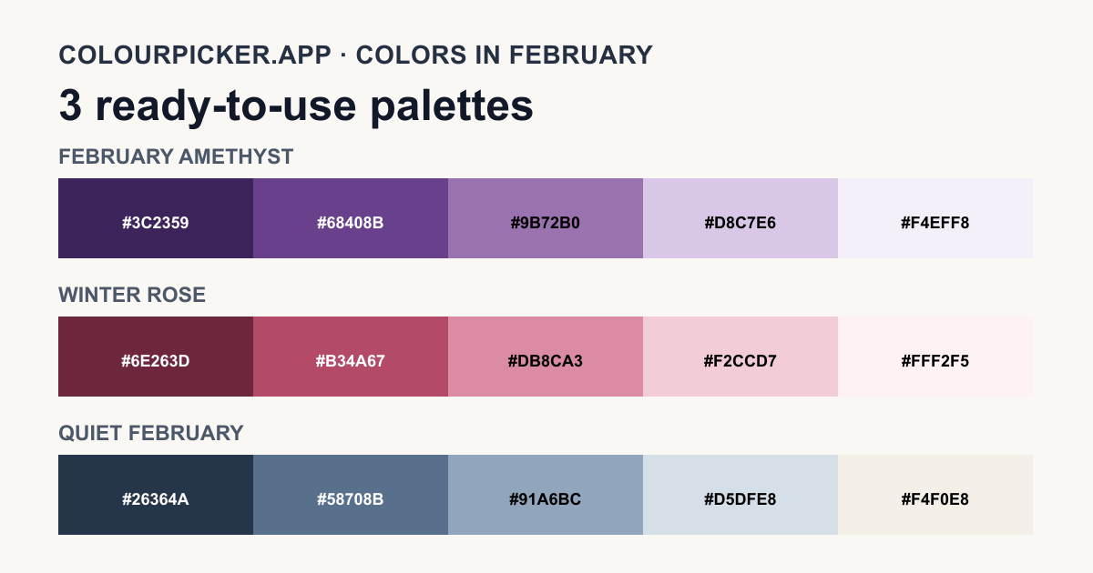
Colors in February can draw from amethyst purple, winter rose tones, or quiet late-winter neutrals. These original colours for February are arranged into three practical palettes, each with five HEX codes for design projects.
Palette 1
February Amethyst
Deep violet, purple and soft lavender form a tonal palette inspired by February’s amethyst birthstone.
Intended use: Invitations, jewelry content, beauty branding, stationery and refined website accents.
Palette 2
Winter Rose
Berry, rose and blush tones create a warm counterpoint to February’s cooler seasonal associations.
Intended use: Seasonal campaigns, invitations, packaging, social graphics and editorial features.
Palette 3
Quiet February
Ink blue, muted slate and misty neutrals create a subdued palette for the transition toward spring.
Intended use: Reports, calm interfaces, winter stationery, editorial layouts and professional presentations.
Choose and adapt a February palette
There is no single official February color or standardized February palette. These are original design interpretations, and seasonal associations vary by location. Choose the palette that fits your project, then verify contrast for every foreground and background combination you use.
Frequently Asked Questions
- What are the colors for February?
- There is no single official February color. Colors in February are often interpreted through amethyst purples, rose and blush tones, and cool late-winter blues or neutrals. Seasonal associations vary by location.
- What is February’s birthstone color?
- Amethyst is February’s birthstone and ranges from lilac to deep purple. The February Amethyst palette is an original design interpretation rather than an official color standard.
- How do I choose a February color palette?
- Choose February Amethyst for rich purple accents, Winter Rose for warm romantic work, or Quiet February for subdued winter-to-spring layouts. Then copy an individual HEX value, all five colors or a CSS custom-property block and adapt it to websites, invitations, packaging or presentations.
- Are these February color palettes accessible?
- Accessibility depends on the exact foreground and background pair. Each swatch identifies whether black or white gives stronger contrast; use the Contrast Checker for other combinations.