Curated color palettes
November Colors: 3 Ready-to-Use Palettes
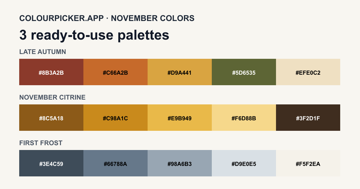
November can suggest the final richness of autumn, the golden tones of citrine and topaz, or the quieter colors of the first frost. These three original palettes turn those interpretations into practical HEX codes.
Palette 1
Late Autumn
Deep rust, burnt orange, harvest gold and olive capture the closing weeks of autumn, with a warm oat cream for backgrounds and quieter layouts.
Intended use: Editorial graphics, seasonal branding, menus, packaging and event material.
Palette 2
November Citrine
Amber, citrine yellow and soft honey tones are grounded by walnut brown, creating a warm palette inspired by November’s commonly associated birthstones.
Intended use: Invitations, refined packaging, accent systems, social graphics and warm website themes.
Palette 3
First Frost
Slate, blue-gray, mist and winter ivory reflect November’s transition from late autumn toward colder, quieter days.
Intended use: Calm interfaces, reports, stationery, editorial layouts and understated winter campaigns.
Choose and adapt a November palette
There is no single official November color palette. Choose the interpretation that fits your project, then verify contrast for every foreground and background combination you use.
Frequently Asked Questions
- What are November colors?
- November colors are commonly interpreted through late-autumn rust, gold, olive and brown, the golden tones associated with citrine and topaz, or cool grays and blue-grays that suggest the approach of winter. There is no single official November palette.
- What is November’s birthstone color?
- Topaz and citrine are commonly associated with November. Yellow, gold and amber are familiar interpretations, but topaz occurs in multiple colors, so the November Citrine palette on this page is an original design interpretation rather than an official standard.
- How can I use these November palettes?
- Copy an individual HEX value or a complete CSS custom-property block, then adapt the palette for websites, invitations, presentations, packaging, social graphics or design tokens.
- Are these November color palettes accessible?
- Accessibility depends on the exact foreground and background pair. Each swatch identifies whether black or white provides stronger contrast; use the Contrast Checker before combining different colors from a palette.